13 min to read
One library to rule them all? Geospatial visualisation tools in Python
The state of play in mid-2021
Let’s assume you wanted to get a first handle on the impressive array of geospatial visualisation capabilities for dealing with vector data in the Python ecosystem. Where would you even start?
| TL;DR: Jump to Graphical Abstract |
The good news is, there are plenty of Python libraries to choose from. And the bad news? There are plenty of Python libraries to choose from…
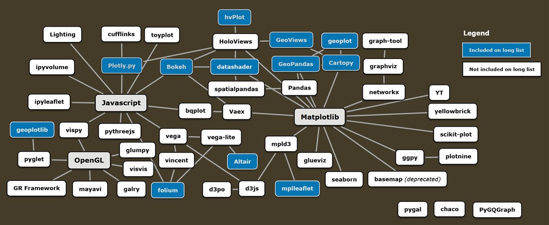
Just to give you a taste, Jake Vander Plas’ excellent talk on and—meta alert!—visualisation of the Python visualisation landscape served as the basis for this (surely incomplete) mind map. Some libraries with geospatial functionalities are highlighted.
So again, where to start?
My supervisor at Ulster University (UU) Robert McNabb and I tried to answer this question in mid-2021 in what then became my MSc thesis and a significantly amended paper available as a preprint. The codebase can be found on Github. As such, this post comes a bit late but I hope some of it may still be relevant in late 2022.
| Disclaimer: This work was my very first foray into Python about 18 months ago. I’ve since come to more fully appreciate the complexity of real-world use cases and production environments which go way beyond trying to visualise vector data on a local machine (the fictional “scenario” I conjured up at the time), but as a first set of data points, I still think such a comparison can be useful. |
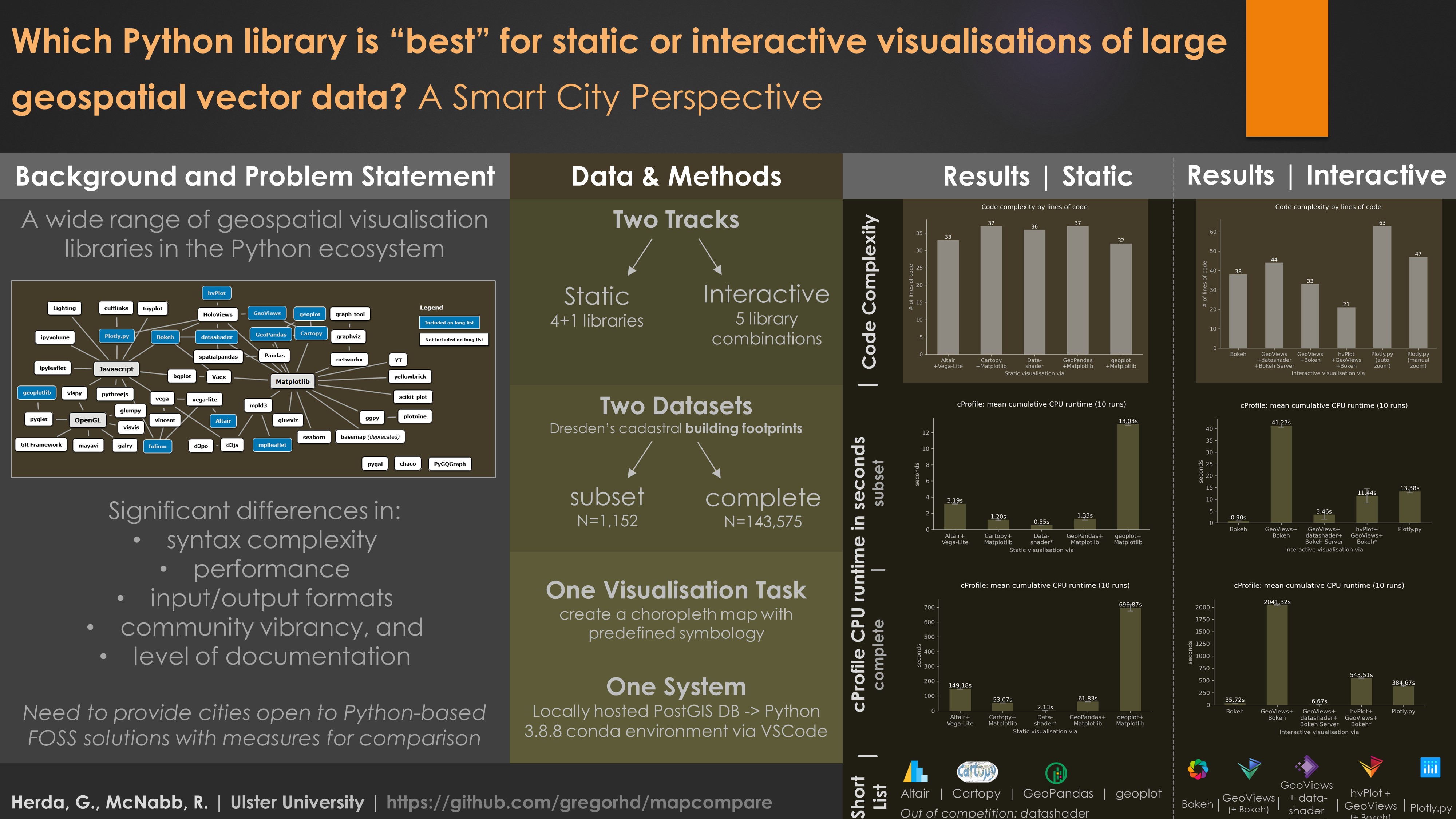
Library selection
First, I tried to get a very broad overview of what’s out there. I looked at various metadata for different libraries supporting geospatial visualisation, eventually creating a long list with the help of pyviz.org and other excellent resources. I compared input and output formats, other libraries central to implementation, ease of installation and some proxy indicators suggesting the vibrancy of the developer and user community.
Next, I winnowed things down to a short list.
The short list tried to include both large-community projects (e.g., Bokeh and Plotly) as well as those relying on much fewer contributors (e.g., geoplot). Since most help you’ll need will end up coming from (largely unpaid) contributors, I figured all short-listed libraries needed to show on-going development in the last year (hence the exclusion, at the time, of mplleaflet and geoplotlib). Also, to remove the confounding variable of connection speeds from my simplistic performance metric, I decided they had to be able to plot geometries without employing a Web Tile Service (hence the exclusion of folium). Finally, I was looking for a good mix of backends and both imperative as well as declarative approaches (such as Altair), resulting in this final short list across both a static and interactive track of comparison.
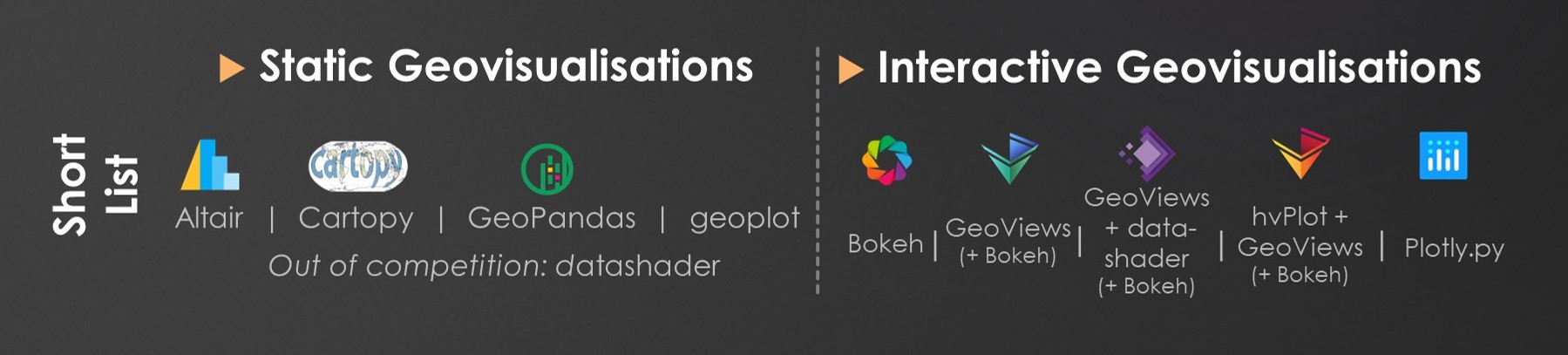
The magical datashader was included in the static track ‘out of competition’, to first demonstrate its ‘as-is’ functionality before employing it in the interactive track with a core plotting library.
Library comparison
With our contestants selected and waiting in the wings, it was time to prepare the “arena”.
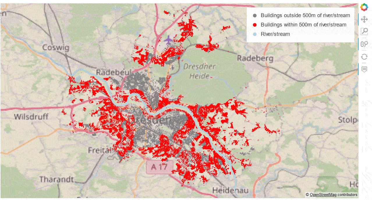
The battleground was a simple visualisation task performed—on my laptop—for both a “complete” dataset and a smaller subset. The complete dataset contained 144,727 polygons representing the city of Dresden’s cadastral building footprints. The subset contained 2,645 features from the same dataset.
Both datasets were stored in locally hosted PostGIS databases and queried via GeoPandas’ from_postgis() function, returning GeoDataFrames to serve as primary data inputs (more on data acquisition and preparation here).
The short-listed libraries were compared with regards to:
- the range of available documentation, based on common documentation ‘elements’ and code examples consulted to implement the task;
- the number of lines of code needed to reproduce the common map template, excluding comments and blank lines. While a very much subjective measure, a relatively similar level of intermediate assignment statements across libraries was attempted;
- the ability to reproduce the map template including a legend and base map;
- “resource requirements” (simply output file size after export to SVG/PNG or HTML; for interactive visualisations, a subjective assessment of ‘responsiveness’ on pan and zoom);
- and the cumulative CPU runtime required for the main
renderFigure()function to complete, averaged across a total of 10 runs. To increase comparability, the rendering function excluded both data acquisition and any data pre-processing, reprojection or conversion steps. CPU runtimes were measured using the cProfile module. For the interactive track, as rendering is ultimately performed by the execution of JavaScript code, cProfile will not capture the entirety of the processing costs (see also the table with some code “adjustments” just above the Results section on Github as well as the Caveats section for more on this).
Results
Documentation
Good documentation is everything. Sadly, often these pages don’t get the love (or funding) they deserve. But things are improving considerably and today I am quite amazed at the pedagogical skill with which new concepts are being introduced to learners, making ample use of the beloved Jupyter Notebook.
It seems that the structure and content of documentation in the Python world has coalesced into a near standard containing a set of reoccurring elements.
A quick start or getting started section can be found on the documentation pages of most libraries. These are almost always structured as explanatory text alternating with code snippets exemplifying a feature or best practice. While straight-forward, new learners without a background in data science or mathematics may find this an initial hurdle, especially once more advanced features are demonstrated. Finding the right range and difficulty of examples for students of different backgrounds is a known problem in data science education in general. Python-based data visualisation is no exception here.
While “getting started” sections are available as static web pages, they are often simply conversions of Jupyter Notebooks which allow users to edit and execute code cells themselves in a locally-run Python kernel and have plots be generated in the browser.
A second element were more extensive user guides. These often cover advanced features and concepts of increasing complexity.
Thirdly, all libraries, except hvPlot, featured an API reference which can be thought of as the official ‘code registry’ or ‘code index’ hierarchically listing all functions and classes accessible to users as well as requirements for positional or keyword arguments. API references largely reproduce the “doc strings”, or non-code explanatory text, appended to a function, method, or class definition. Except for more advanced users, the API reference rarely serves as the first learning resource but is essential if you really want to understand error messages or explore more advanced features.
Finally, don’t forget the example galleries or reference galleries. These provide output examples along with the sample data and underlying code, and can significantly flatten your learning curve.
Not in all cases, however, will this ‘formally provided’ documentation help you understand what’s happening. Therefore, you may find yourself going down some rather obscure rabbit holes on GitHub and StackOverflow, which can be a real lottery: Depending on the size of the user base, and assuming your problem matches somebody’s prior knowledge, questions are often resolved in a matter of hours. Other times, responses may never materialise or fail to address your issue (maybe because a fix is not due until the next major release). I encountered both scenarios, though the latter much less often.
The gist on documentation: For this study, the degree to which I had to ask around varied significantly between libraries, with some requiring multiple elaborate questions to be posted (e.g. GeoViews, datashader, Altair), others (e.g. Cartopy, GeoPandas, Plotly.py) requiring no interaction. Where it was necessary, this could be due to a genuine gap in documentation or my own spotty understanding.
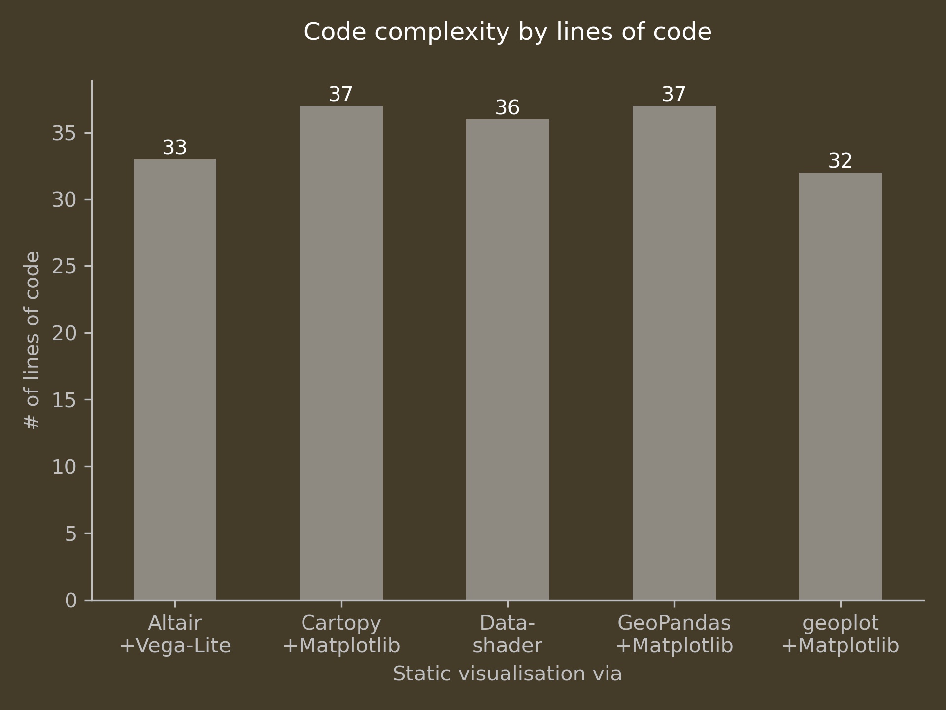
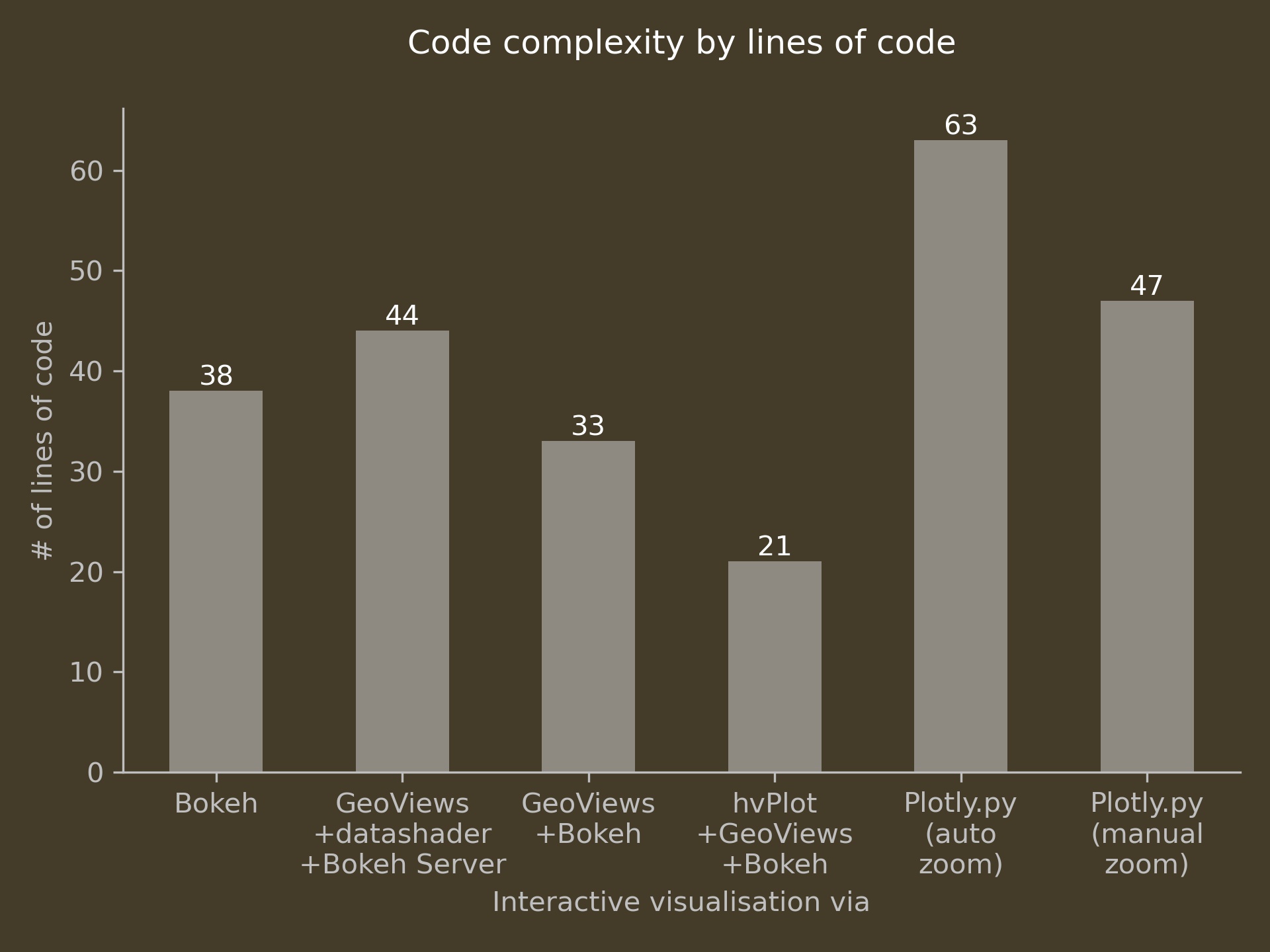
Code complexity
While anything but a scientific measure of comparison, I did find that the level of verbosity differed widely for this very simple plotting task, where more succinct, high-level APIs did not, in my view, sacrifice functionality or customisability.
| Static | Interactive |
|---|---|
 |
 |
For static visualisations, you can see that code complexity, by this measure, is largely comparable. Especially with non-geospatial use cases from traditional data science, declarative approaches can be far more economical once key and value dimensions are declared. Due to the imperative nature of the plotting task at hand, this relative advantage of declarative approaches could not really materialise here.
In the interactive track, things got a bit more interesting.
Plotly.py’s syntax was the most complex despite employing the more user friendly Plotly Express interface. This is because one, apparently (?), has to write the data to disk into an intermediary JSON file. Therefore, Plotly.py’s line count remains high even without adding auto zoom functionality (which may be available out of the box by now).
GeoViews and, especially, hvPlot significantly simplify interacting with Bokeh’s standard API, with widely varying costs to overall performance.
CPU runtime
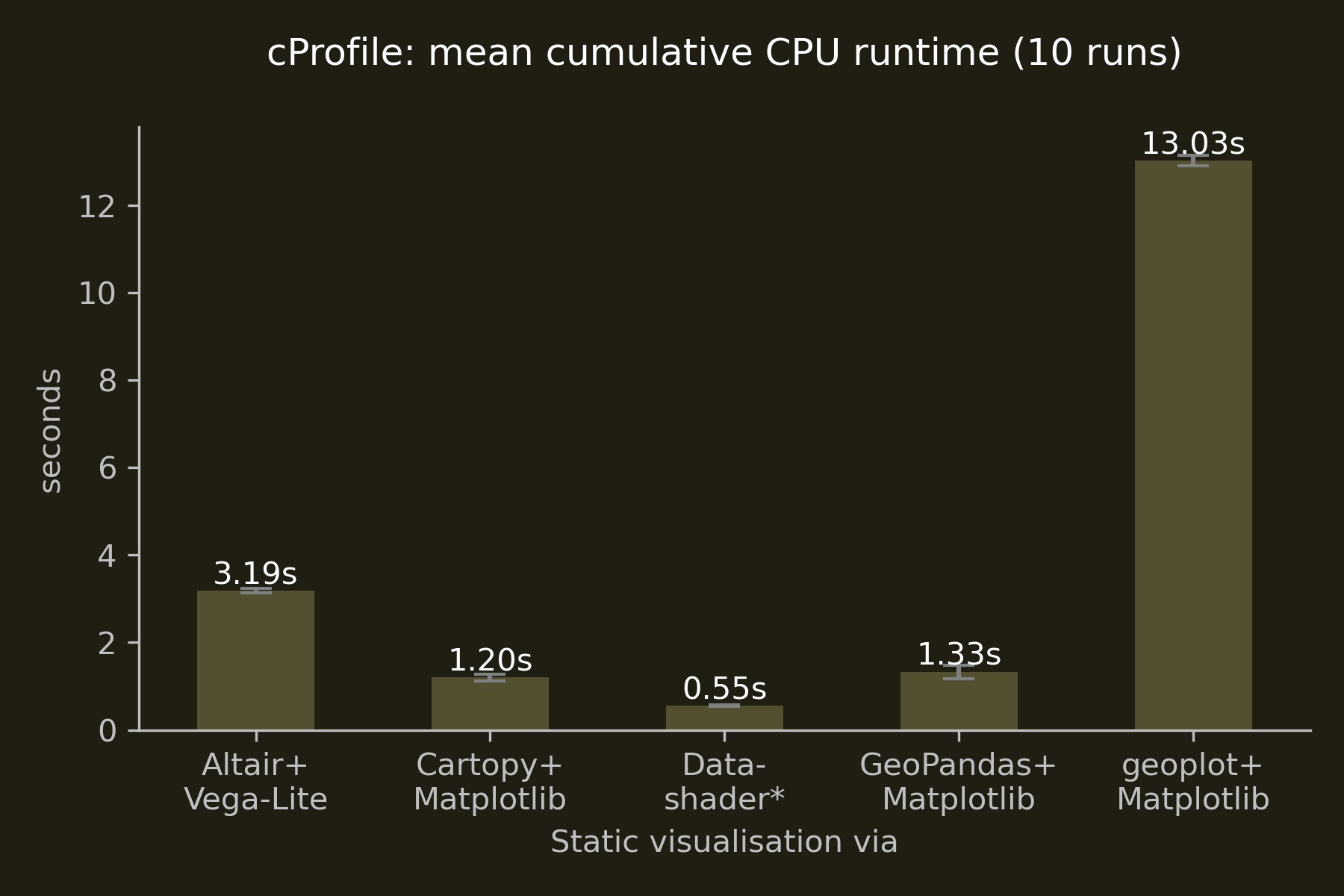
Static visualisations
| Subset | Complete |
|---|---|
 |
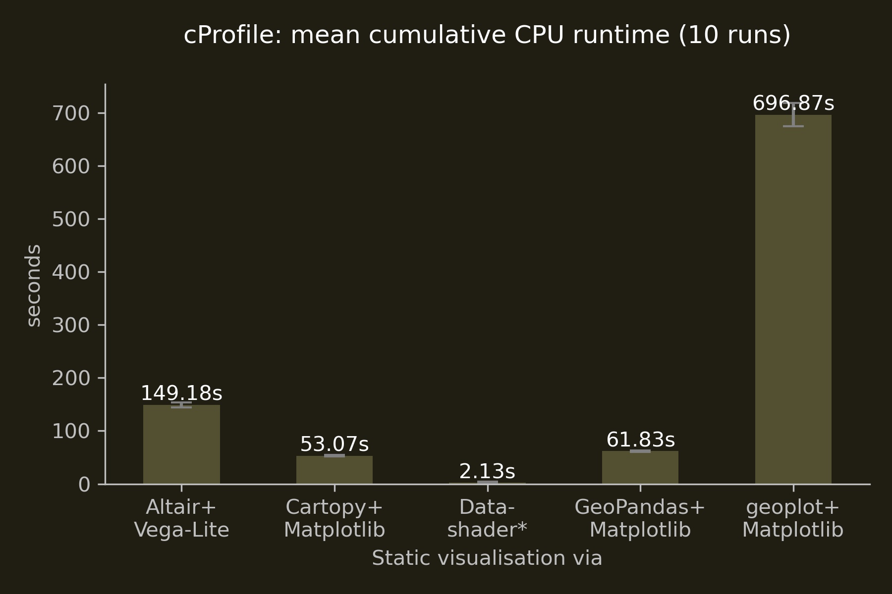 |
Of the three Matplotlib-based libraries, Cartopy marginally outperformed GeoPandas, while Altair’s interface to Vega-Lite ran three times longer than these two Matplotlib interfaces.
The stark difference of geoplot’s performance to, for instance, Cartopy may be due to different entry points to Matplotlib, which is a massively complex library at this point and thus proved too tough a nut to crack in the time available.
In case you’re interested: Datashader’s large standard deviation of 1.853 seconds with a mean of 1.564 seconds is due to its use of the Numba compiler, which provides similar performance to a traditional compiled language. The significant performance gains materialise only after compilation in the first run which you can see very nicely below in the individual datashader CPU runtimes in this 10-run loop.
| run # | time | run # | time |
|---|---|---|---|
| 1 | 6.837 | 6 | 0.993 |
| 2 | 0.946 | 7 | 1.000 |
| 3 | 0.979 | 8 | 0.967 |
| 4 | 1.032 | 9 | 0.961 |
| 5 | 0.972 | 10 | 0.951 |
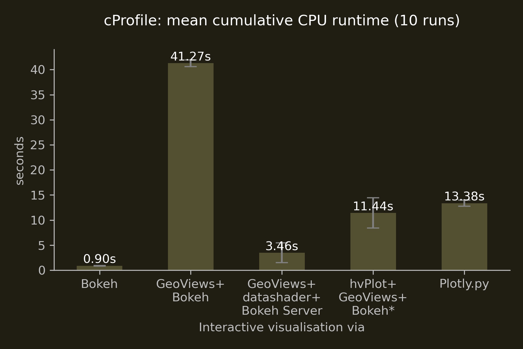
Interactive visualisations
| Subset | Complete |
|---|---|
 |
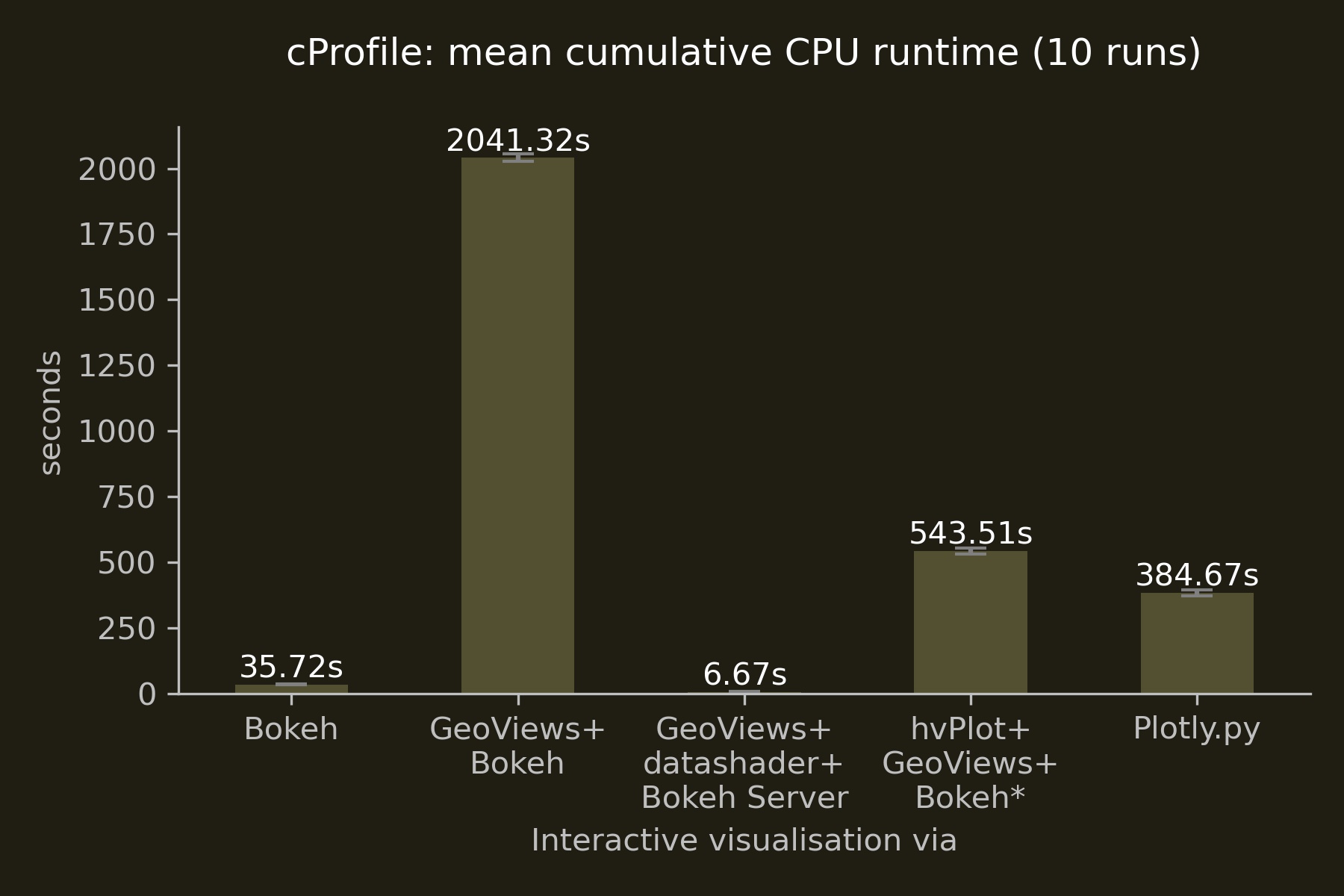 |
Surprising were the stark differences in runtime between the three Bokeh-based implementations making no use of datashader: interfacing with Bokeh through hvPlot proved to be 3.7 times faster than interacting with Bokeh through GeoViews. Engaging with Bokeh’s API directly outperformed hvPlot and GeoViews by a factor of 15.5 and 58, respectively. Despite consultations with the developers, I was not able to pin down the reasons for GeoView’s poor performance. One possible explanation could be the additional layers of abstraction between GeoViews and Bokeh (via HoloViews), although hvPlot employs an even higher level of abstraction and, also being a HoloViz product, has similar dependencies—but without incurring a similar penalty.
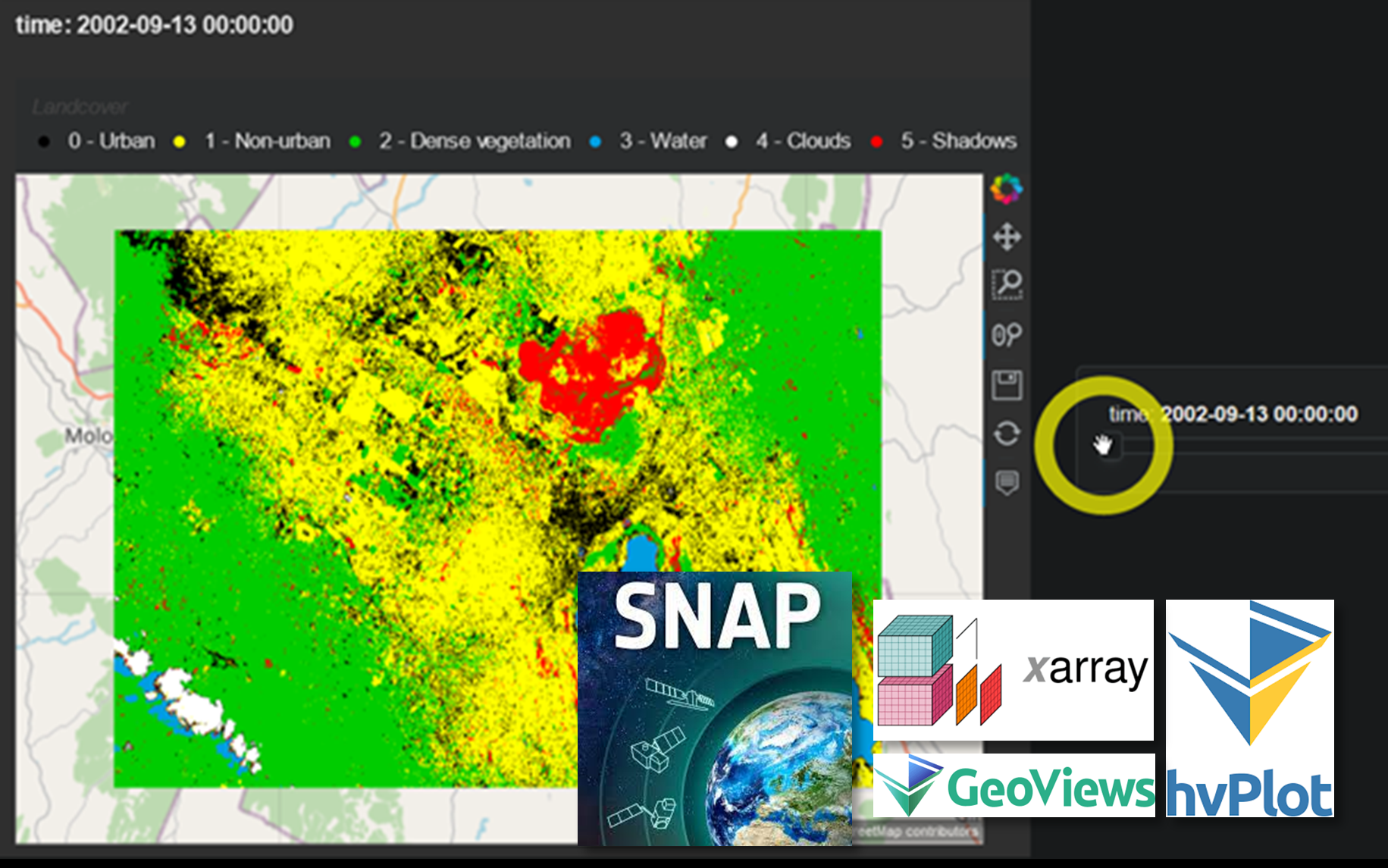
The interactive “performance winner” is the combination of GeoViews + datashader + Bokeh Server, combining Bokeh’s interactive features with low client-side resource use. Below you can see this combination in action. Building footprints are being rasterised by datashader on-the-fly at ever higher resolutions as you zoom in while preserving the ability to interactively access the polygons’ attributes via the hover tool.
TL;DR: Graphical Abstract
Caveats
- All of the short-listed libraries employ multiple complex technologies, some of which outside the Python ecosystem (e.g., the JavaScript libraries underlying both Bokeh and Plotly.py). Due to these confounding variables, and even with the various code adjustments mentioned above, I most certainly failed to establish a truly level playing field with regard to comparing CPU runtimes. What the cProfile results show is simply indicative of the user experience and the approximate time required to generate a map product on screen.
- Lines of code is a poor measure for code complexity. Alternatively, one could see groups of experts for each implementation develop a ‘best practice’ code sample, though I’m sceptical this would increase comparability (or would be feasible in practice).
- The static map products would not be considered useful outputs in most real-world scenarios: due to significant overplotting, a building-level analysis would rarely be presented at such a small representative fraction. And as for the interactive products, except for live server-side aggregation and rasterisation as demonstrated by the GeoViews + datashader + Bokeh Server implementation, serving large quantities of geospatial data over the web would nowadays probably involve prior conversion to raster or vector tiles.
- The simplicity of the visualisation task meant that more advanced, and for users such as local authorities potentially more interesting, use cases such as dashboarding were not demonstrated. If this is something you’d like to explore, do check out Bokeh’s and Plotly’s native dashboarding capabilities (Dash) as well as HoloViz’s Panel library including its app gallery on awesome-panel.org for inspiration.
- Due to the interconnectedness of the Python ecosystem, a library’s functionalities and performance can never be solely attributed to its own codebase.
- Finally, all libraries as well as their dependencies are under constant development. As such, the state of play outlined here represents merely a snapshot as of mid-2021.
I hope you enjoyed watching my younger self learn about these exciting new technologies, and maybe some of this was insightful for you as well.
Do leave a comment and let me know what you think 😊

Comments