10 min to read
Remote sensing Nakuru's urban growth (3) | SNAP, hvPlot
Data: Landsat 5-8 | Tools: SNAP, QGIS/GRASS, Xarray, GeoViews, hvPlot
This is Part 3 in our series on remote sensing Nakuru’s urban growth. While Part 1 used on-screen digitisation but commercial software and Part 2 used free tools but relied on existing land cover maps to supply the training data, Part 3 will use free and open source software as well as on-screen digitisation for collecting training data using the European Space Agency’s Sentinel Application Platform (SNAP). Don’t let the name fool you: SNAP is capable of handling a dizzying array of optical sensors, not only those associated with the Sentinel missions. In addition, it really stands out by way of its intuitive user interface and clever design choices. Finally, to interactively present our results, we will make use of HoloViz’s hvPlot Python library, an easy-to-use high-level API to HoloViz’ entire suite of tools.
Downloads: All raw Landsat scenes used in this workflow are linked in Part 1. The notebook can be downloaded here. You can download the source GeoTIFFs for the notebook and a QGIS style file here.
- Import, resampling and subsetting - SNAP
- Supervised classification and recoding - SNAP/QGIS with GRASS
- Data prep and symbology - Xarray and GeoViews
- Final output - hvPlot
Import, resampling and subsetting - SNAP
First, we import the Landsat 7 scene from 2002 by extracting the tar.gz. Then, in SNAP select File->Import->Optical Sensors->Landsat->Landsat (GeoTIFF) and select the file ending in _MTL.txt we just extracted along with the GeoTIFFs (this may create two identical products in the Product Explorer, so you can remove the second one, if so). The procedure is the same for the Landsat8 in 30m (GeoTIFF) option, whereas you can select the .zip directly if choosing the Landsat 5 TM (FAST) import option.
As the Landsat 7 bands have different spatial resolutions and the SNAP classification module would object to that later on, we are resampling all the bands to 30m via Raster->Geometric->Resampling and selecting the By pixel resolution (in m) radio button under the Resampling Parameters tab. This step won’t be necessary for the Landsat 5 scene from 2011, but would be required for the Landsat 8 scene from 2020 if you intend to make use of the originally 100m thermal infrared bands in your classification.
Next, we ‘subset’, or clip, our scene to only our study area. We could ‘mask’ the scene by importing a Shapefile of our study area via Import->Vector Data->ESRI Shapefile and selecting it under Raster->Masks->Land/Sea Mask and Use Vector as Mask in the Processing Parameters tab (yes, that currently seems to be the only location where you can directly select a shapefile for masking). This, however, would not affect the dimensions of the scene but simply apply a mask to only our study area. Instead, a better option, though also slightly awkward, is to manually enter the bounds of our study area in degrees under Raster->Geometric->Subset and navigating to the Geo Coordinates sub-tab on the Spatial Subset tab (project your study area to EPSG:4326 to get the bounds in degrees). This will create a ‘subset_of..’ product.
Note: For Landsat 8 and Sentinel 2 data, it seems to be necessary to reproject the scene to WGS84 before collecting training data, via Raster->Geometric->Reprojection, as the overlap between vectors and rasters seems to be faulty for some UTM zones. If you are working with multiple optical sensors, as we do here, don’t forget to bring your final classified rasters back into the same CRS once you’re done.
Supervised classification and recoding - SNAP/QGIS with GRASS
Prof. Shaun Levick of Charles Darwin University has produced an excellent series of Youtube tutorials for working with SNAP. The installment on supervised classification will get you started quickly.
For this part, I collected training data for an initial 8 information classes:
- 0: Urban
- 1: Crops
- 2: Dense vegetation
- 3: Savanna
- 4: Bare soil
- 5: Water
- 6: Clouds (though the USGS provided cloud mask would have done the trick)
- 7: Shadow (especially for Menengai Crater)
Once we confirm for each of the bands that there is very little overlap between classes and make sure the distributions have only one peak, via the very handy Analysis->Statistics tool (hit the Refresh button each time you select a different band in the Product Explorer), we run a Random Forest classification and export the resulting SNAP product to a GeoTIFF. Sometimes the post-classification GeoTIFF contains two additional bands you don’t need. You can remove these with the QGIS Rearrange bands tool, if needed.
Subsequently, we use the GRASS r.reclass module accessible via the QGIS Desktop with GRASS Processing Toolbox to again simplify the landcover classes by merging crops, savanna and bare soil into a composite ‘non-urban’ class. For this, we can save the following reclass rules in a text file and select it in the r.reclass dialog:
0	= 0
1 3 4	= 1
2	= 2
3	= 3
4	= 4
5	= 5
Note: Before moving on to the next section, it is worth visually confirming in QGIS whether all your rasters align perfectly and whether they have the exact same dimensions. In my case, since the Landsat 8 scene needed to be reprojected and the others didn’t, there was some misalignment in the (pre-) final GeoTIFFs. To correct this, I had to gdalwarp (available via the QGIS Warp (reproject) tool) the L8 scene to the L5 scene’s native CRS (ESPG:32636) and extent, applying the -te, -tr and -tap arguments. I then gdalwarped the L5 and L7 scenes to EPSG:32636 as well, despite them already being in the same CRS, but applying the -tap argument to ensure exact alignment.
Data prep and symbology - Xarray and GeoViews
As usual, we start with all the necessary imports.
import glob
import xarray as xr
import pandas as pd
from cartopy import crs as ccrs
import hvplot.xarray
import geoviews as gv

# give our plot a nice dark theme courtesy of Bokeh
gv.renderer('bokeh').theme = 'dark_minimal'
We then need to create an Xarray Dataset from our three GeoTIFF files and add in some additional metadata (kudos to Digital Earth Australia for a great tutorial on this).
# Create list of file paths for all final GeoTIFFs in our folder
tif_list = glob.glob('03_final/*.tif')

# Create a 'time' coordinate along which to later display each DataArray
time_var = xr.Variable('time', pd.to_datetime(['2002-09-13', '2011-09-14', '2020-10-08']))

# Load and concatenate all individual GeoTIFFs
da = xr.concat([xr.open_rasterio(i) for i in tif_list], dim=time_var)

# Convert to dataset
ds = da.to_dataset('band')

# rename the dataset's first (and only) data variable
ds = ds.rename({1: 'landcover'})

# This resets my no data values from 255 to nan
ds = ds.where(ds['landcover'] != 255)
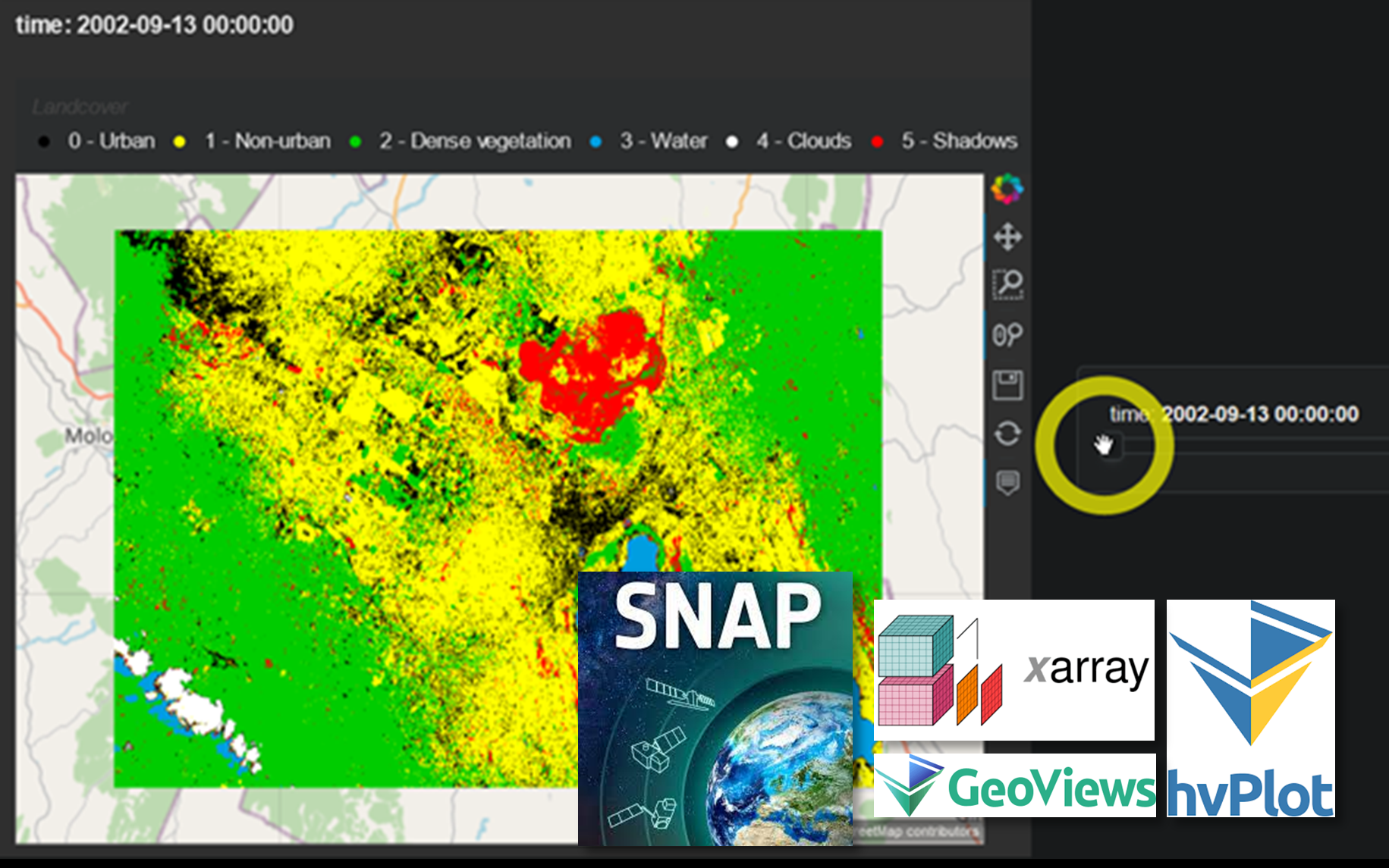
The approach to symbology and legend creation is similar to what we used in the datashader example here. We simply need to make sure that the order of information classes in the color_key dict matches the order of integer values in our data.
# define the labels and corresponding colors
color_key = {'0 - Urban': '#000000',
             '1 - Non-urban': '#FFFF00',
             '2 - Dense vegetation': '#00CC00',
             '3 - Water': '#009EE0',
             '4 - Clouds': '#FFFFFF',
             '5 - Shadows': '#FF0000'
            }

legend = gv.NdOverlay(
    {k: gv.Points([0,0], label=str(k)).opts(color=v, apply_ranges=False) for k, v in color_key.items()},
    'Landcover').opts(legend_position='top'
    )
Final output - hvPlot
The magic of hvPlot is its superbly succinct syntax. After defining our plot’s look and features through keyword arguments all contained in a single function call, we simply ‘multiply’ the individual HoloViews elements we defined using the * operator to create an Overlay, in this case consisting of the plot itself and the legend - and we’re done! This is even simpler when working with tabular data or if you don’t particularly care which colors you use - hvPlot will create the legend for you.
By setting the groupby= keyword argument, hvPlot is able to automatically add a slider widget allowing us to change between the Dataset’s three DataArrays along the ‘time’ dimension (depending on the size of your data, there may be a slight delay of a few seconds before the plot updates in a live notebook).
plot = ds.landcover.hvplot(groupby='time', frame_width=600, data_aspect=1,
                           yaxis=None, xaxis=None,
                           colorbar=False, cmap=[v for v in color_key.values()],

                           # defining the data's CRS is only really necessary,
                           # if you want to add a tile layer underneath
                           crs=ccrs.UTM(36), tiles=True
                          )

# We can set all of Bokeh's figure settings as part of the '.opts()' method
overlay = (plot * legend).opts(active_tools=['wheel_zoom'])

overlay
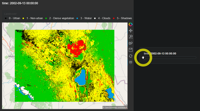
Not a perfect classification by any means (my heart goes out to all those urban areas disappearing between 2002 and 2011!), but good enough for demonstrating what’s possible.
Finally, if we want, we can save our plot to an HTML file which, in this case, runs to around 100Mb, a good indication that making use of hvPlot’s built-in datashader support is worth considering for wider distribution.
hvplot.save(overlay,'nakuru-pt3.html')
So there you have it! Another free and open-source workflow for remote sensing and data visualisation.
As always, thoughts, comments and critique are more than welcome.

Comments